Flourishing Tips
My Fearless Flourishing online course opens next week - so wanted to share a bit of my journey here!
When I first started my pointed pen calligraphy journey back in 2014, I quickly fell in LOVE with flourishing and the 'fancy loops'..but had no idea where to begin or how to flourish! If anything, whenever I tried to copy someone or imitate something I saw in a book, it looked awkward and off. But I was determined to figure it out and over the past 9 years...I began to practice, study, and my flourishing evolved to what it is today :)
2019

2021-2023:


---------------
When I first started, I had fears and uncertainties of where to place my flourishes and mainly copied from others/books/etc. Niney years later, now that I have a strong understanding of WHY and HOW to flourish... I am really enjoying the whole design part of flourishing. I am able to make thoughtful decisions on where to place flourishes, what to avoid, and how to make the whole composition flow.
Couple of ...
3 Tips when Writing on Textured Paper

If you've been on Instagram long enough, you probably came across gorgeous handmade paper. There's just something about seeing calligraphy written on slightly textured paper. I enjoy incorporating it whenever I can - towards workshop placecards, cards, envelopes, etc.
However, you may quickly realize that writing on textured paper is not as easy as it looks.
Here are 3 tips to make this experience more enjoyable:
- Check your nib. Generally, I like to use a nib with a sturdy tip. Nothing too sharp or too flexible. I avoid nibs like Hunt 101 but gravitate towards nibs like Nikko G or Gillott 404. I find that the more flexible the tip is, the harder it is to control on the upstrokes, especially against all the fiber on the paper! Make sure to experiment with a couple of nibs on a scrap paper before you write on your final paper.
- Check your ink. Do a scribble on your paper and see if your ink is flowing easily from your nib. Sometimes the ink that worked well on smooth paper won't ...
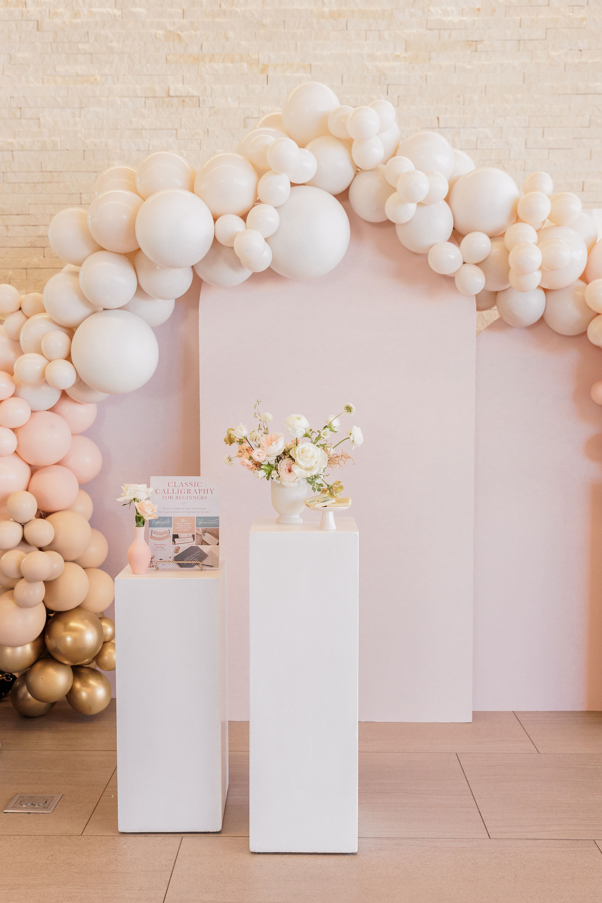
8/21/22 Book Launch Party 🎉🎉🎉

YAY, we did it!! We made it through my first book launch party 😄🎉💖
"Classic Calligraphy for Beginners" officially published on July 12, 2022 and I remember going back and forth if I should throw a party or not. I like to call myself an extroverted introvert. As an extrovert, I LOVE meeting people, connecting, socializing...but the introverted side of me doesn't like to draw attention to myself and would much rather choose to do a coffee date than be at a large event haha. But, with the encouragement of friends and recognizing that publishing a book is WORTH celebrating, I figured...why not?? :) It ended up being a heartfelt & joyous time that will be forever be etched in my memory. Not only was I blessed to be surrounded by my dear community of family and friends, I loved meeting online students and insta-friends in real life!
All I know is that I could not have pulled it off on my own. When they say "it takes a village to raise a child", it was the same with this book baby. The...
#1 New Release in Calligraphy Guides on Amazon! 🎉
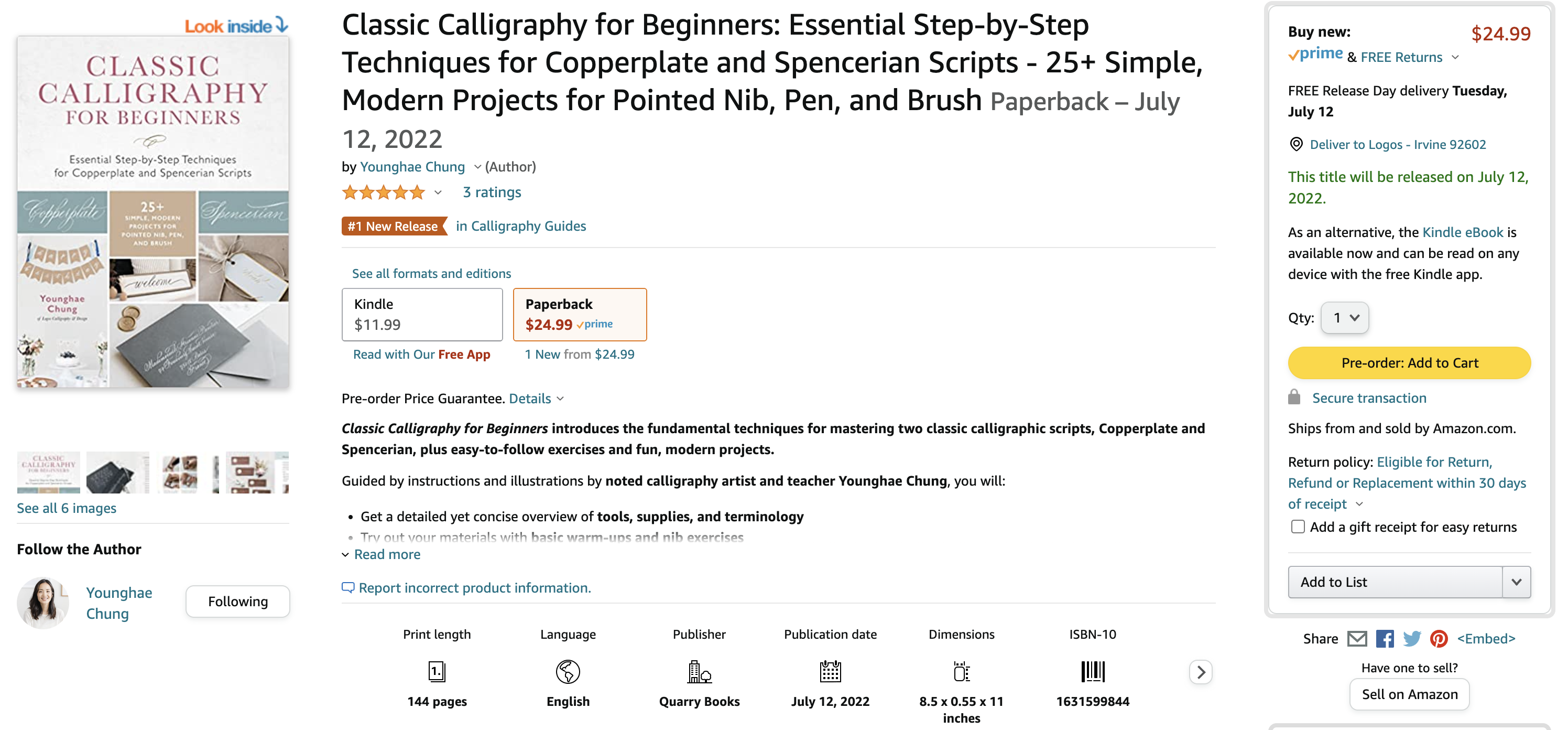
SO excited to see my book come up as #1 New Release in Calligraphy Guides on Amazon! :) It's because of YOU guys that my book is being seen and shared to so many. As you can imagine, the competition is so fierce on Amazon and I'm not sure how much longer it will stay #1, but regardless of the ranking...I am so grateful for every comment, every email, every DM that I've received over the past couple of months. Taking on this project came with much excitement but I also felt this tremendous weight wondering if I would do justice to this beautiful form of art. So your words of encouragement, kindness have really meant alot to me. THANK YOU 🙏🏼
I also received notice from the publisher that the co-edition team has already contracted the book to be translated into other languages. Eventually, the book will be available in:
![]() German/World
German/World![]() Korean/World
Korean/World![]() Dutch/World
Dutch/World![]() Spanish/Latin America excluding Cono Sur (Argentina/Chile/Uruguay) and Peru
Spanish/Latin America excluding Cono Sur (Argentina/Chile/Uruguay) and Peru![]() Spanish/Cono Sur and Peru
Spanish/Cono Sur and Peru
The publisher shared how ...
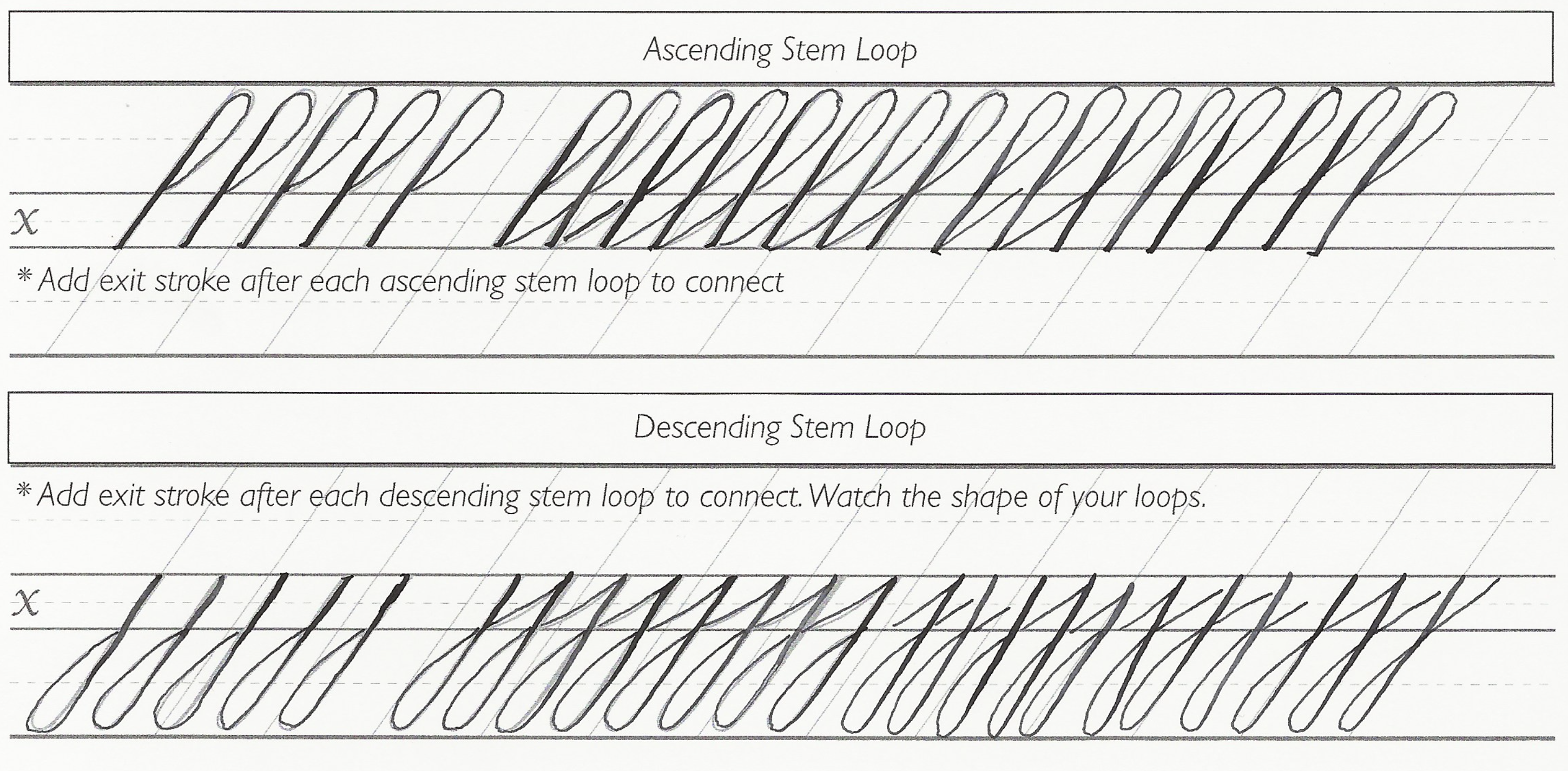
*NEW* Guidesheet for Ascending/Descending Stem Loops
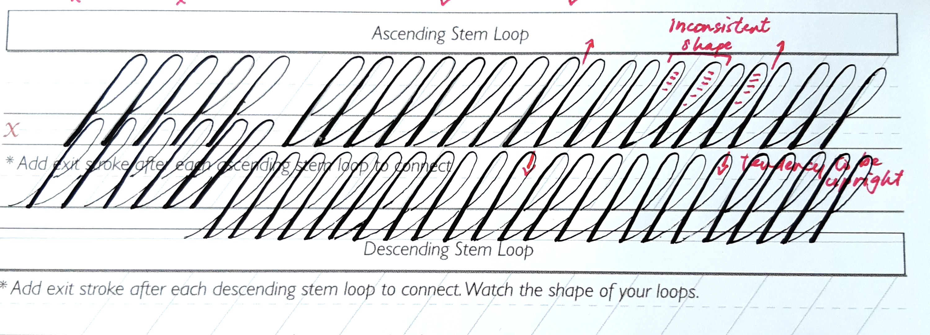
I'm currently guiding my students through my Copperplate Foundations course and noticed that students have been struggling with consistency in their ascending/descending stem loops:
Below are some examples of students' homework sheets. If we're not careful, the loops can either become too narrow or too rounded:
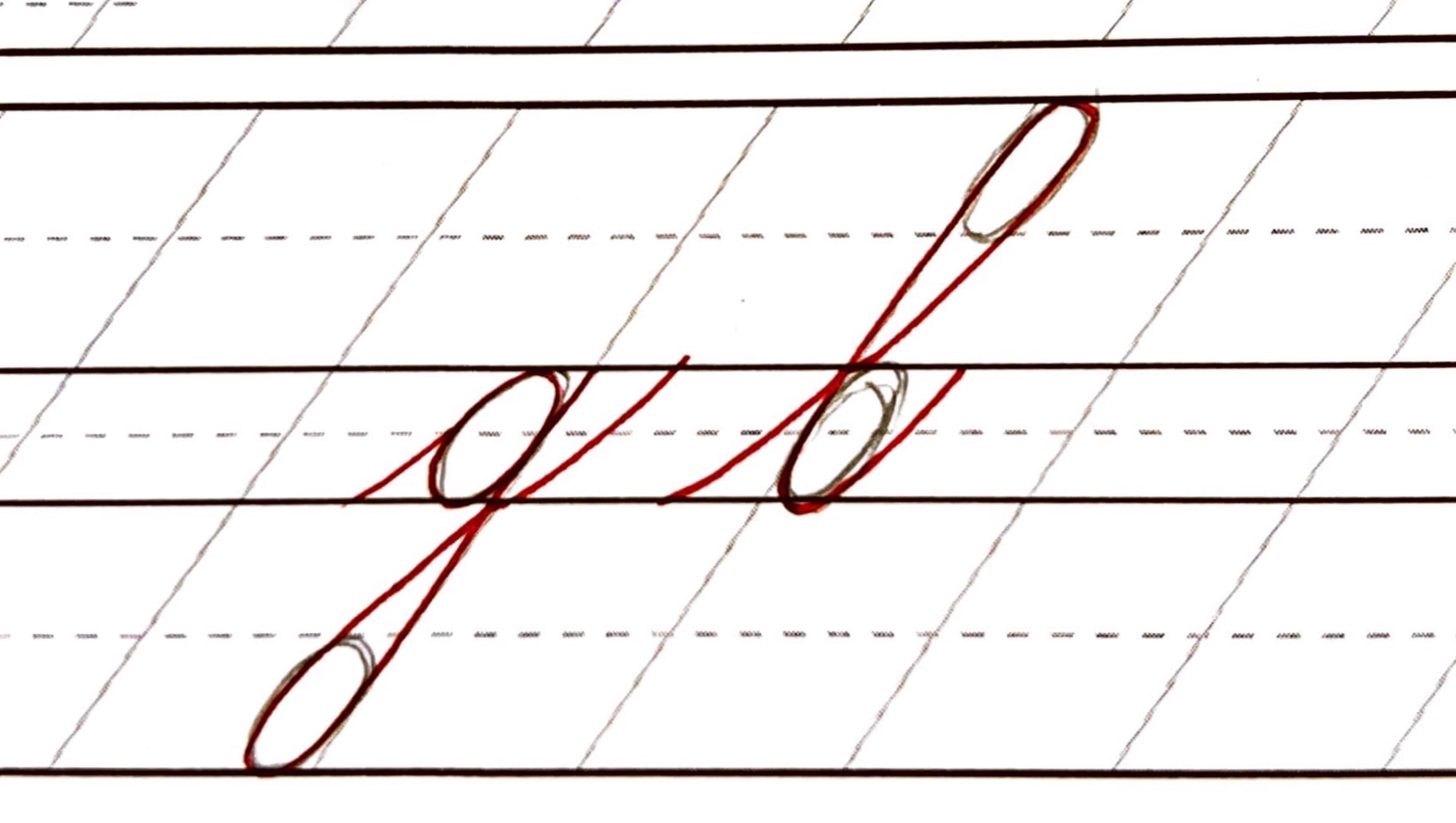
An important key to achieving consistency in the ascending and descending stem loops is to visualize an oval within the loop. Here is an example of lowercase letter 'g' and 'l' where I drew in an oval with a pencil before writing the letters with a red pen:
This demonstration gave me an idea to create a new guidesheet so you can use it to practice those stem loops! In the new guidesheet, I added ovals along the ascender and descender line so that you can practice both the ascending/descending stem loops. Remember that these ovals are meant to be used as a guide so it's okay if your stem loops don't contain the entire oval. Take your time, write slowly, practice, an...
Classic Calligraphy for Beginners - An Update
My new book "Classic Calligraphy for Beginners" will be releasing soon! Initially it was scheduled to release June 14th but I just heard from my publisher last week that due to unforeseen shipping delays, the pub date will be pushed back to July 12, 2022. The UK and ebook publication date will still remain as is! Of course I am a bit disappointed, but after working on it for over a year, waiting one more month will be worth it :) Thank you for your patience and understanding ❤️
As we count down together, I wanted to take this time to answer the following question I received recently: "What is the difference between your new book and your practice pads? Will your new book cover most of the materials in the practice pads?"
To help answer the question, let me show you the table of contents from the new book:
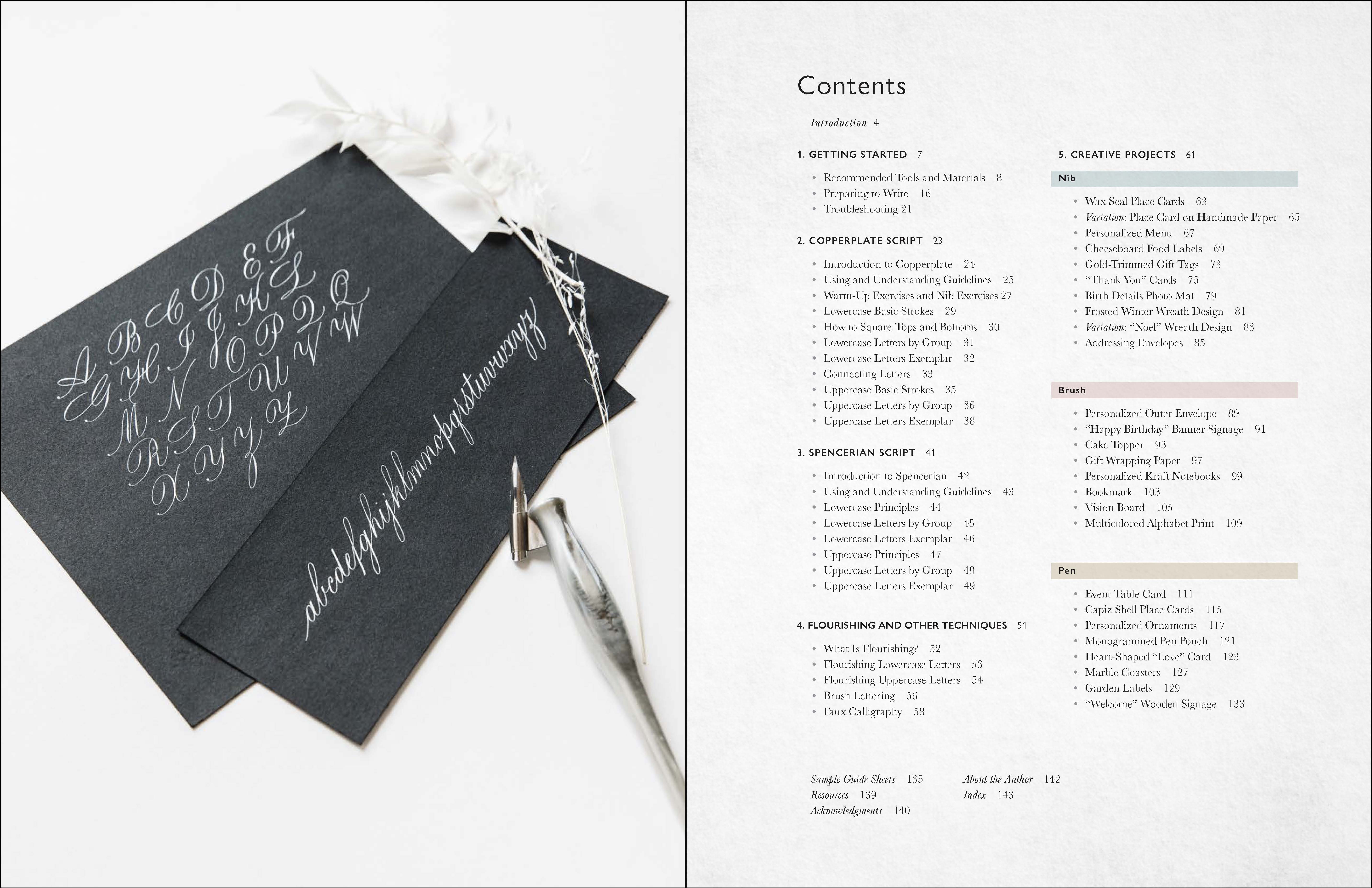
As you can see, the book will have some basic introduction to calligraphy, Copperplate, Spencerian, and a chapter that includes flourishing, brush lettering, and faux calligra...
Copperplate vs. Spencerian
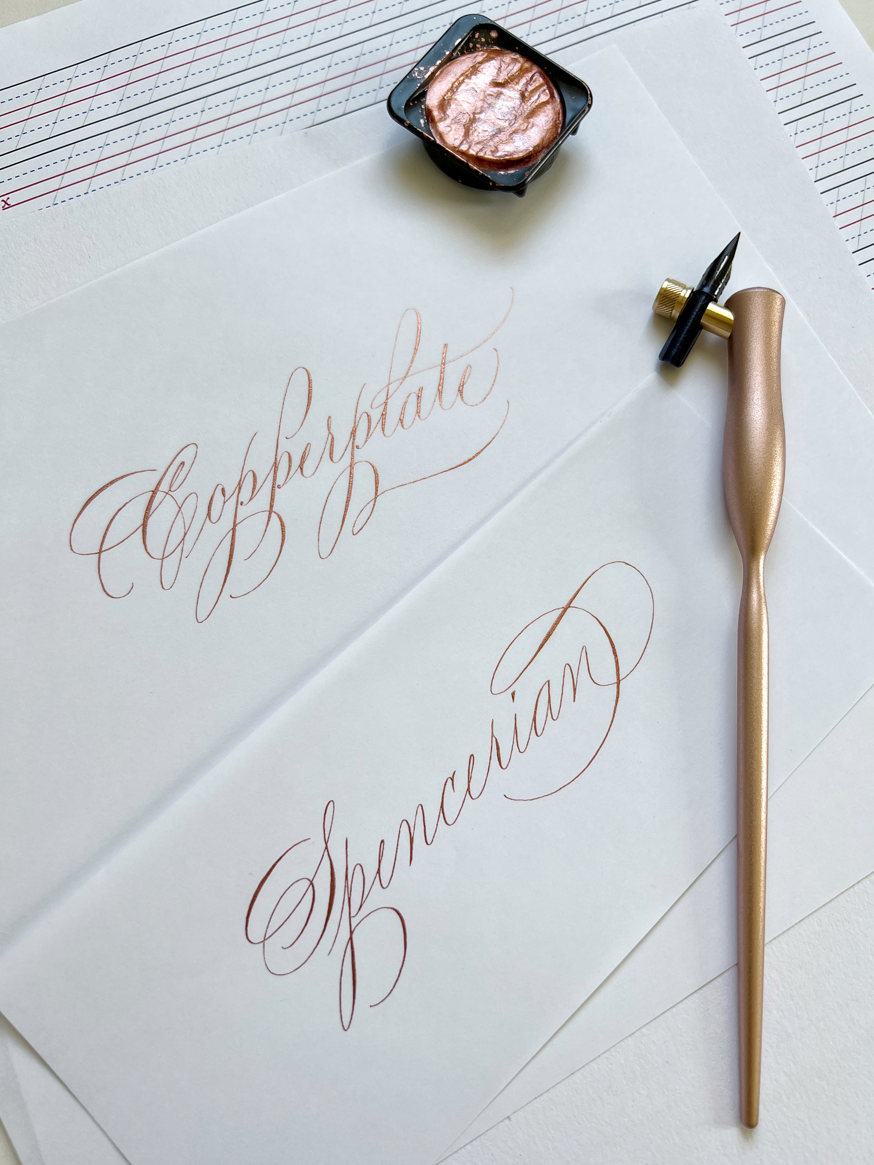
As I've been posting more of my Spencerian work on Instagram to gear up for my upcoming online course, I got a question recently asking what the difference is between Copperplate and Spencerian script.
Before we talk about the differences, let's talk about the similarities between these scripts:
- Copperplate and Spencerian are both written with a steel, flexible pointed nib. So, as long as you know how to write with a pointed nib, the transition and learning curve will be easier to go from one to another. I personally learned Copperplate first and then picked up Spencerian a year later, but you can also begin with Spencerian and move onto Copperplate. These scripts complement each other so wonderfully.
- Both scripts are written on a slant. The standard slant line is 55° for Copperplate and 52° for Spencerian. When teaching, I use the standard as our guide but the difference of 3° is so minor that when you eventually write without guidesheets, you can mix these scripts together (ex ...
STMABD = Small Things Make a Big Difference

With my Copperplate Foundations registration opening up around the corner on 4/19, this saying came to mind - "Small things make a big difference". That doesn't just apply to calligraphy but all part of our lives. I find that it's the seemingly small & mundane choices we make (from the food we eat to what we believe to be true in our minds) that will have the biggest impact in our lives.
This is my 8th year since embarking on this calligraphy journey and if there's any tip I would share to beginners, it would be to choose quality over quantity when it comes to practice times. Being intentional with the 20 minutes you have will be of greater value than spending 2 hours practicing mindlessly, which will lead to bad habits.
One way you can improve your script is to practice your pressure/release! Two things to keep in mind:
- We all have a unique hand. Some of us have a naturally light hand and others have a heavy hand. What does that mean? It means that for those who have a natural ...
Tips when using Finetec & Handmade Paper
As calligraphers, the words "Finetec" and "handmade paper" are no strangers to us. In fact, I actually got introduced to Finetec during my first Copperplate workshop back in 2014! My instructor had demonstrated writing our names with it and I was so mesmerized by the shimmer and how elegant it looked on paper. I bought my first palette right away and now I'm honored to be an Art Ambassador with Royal Talens who helps distribute Finetec in North America.
Finetec is a line of high quality watercolor and offers a variety of transparent, neon, pearlescent, iridescent, metallic colors that work beautifully for calligraphy.
How to use - Finetec comes in pans and in order to properly use it with a pointed nib, you will need to dilute it with water until you get a milk like consistency. Add a couple drops of distilled water directly onto the pan (I like to keep my water in a dropper bottle), mix with a brush, and load it onto the nib (both front and back!) until it covers the eye of the nib. ...
Brand Ambassador for Tom's Studio
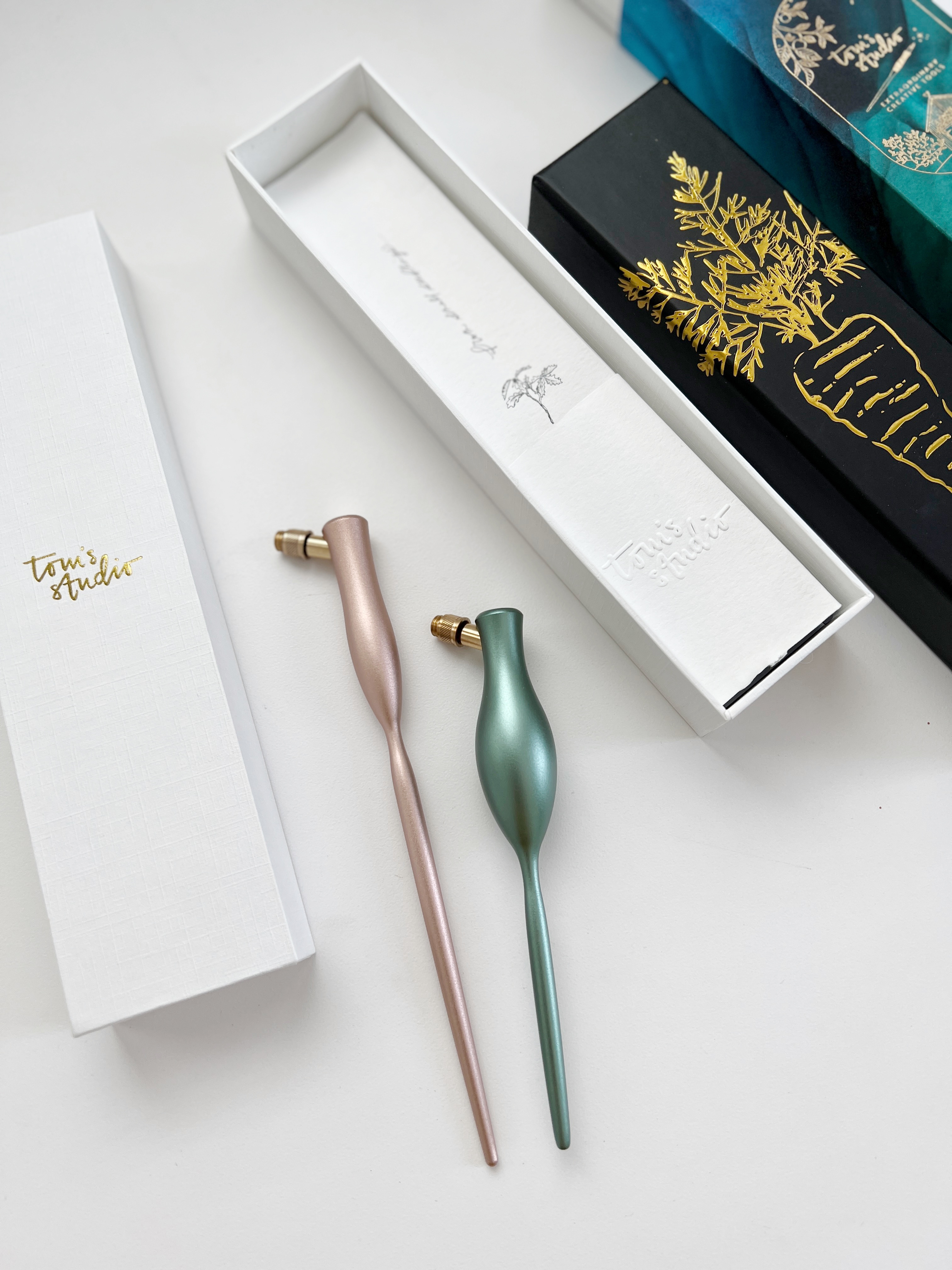
Hi!
It's been a while since my last blog post..but I'm excited to come back with an exciting announcement! I will be joining as a Brand Ambassador (BA) for Tom's Studio 🎉 If you haven't heard of them, they are a small business/brand run by Tom + his wife Gemma. They are quite a dynamic duo and produce some of the most beautiful pens that are made to last a lifetime. When Gemma reached out to see if I would be interested in joining as a BA, there was no question in my mind. I am so thrilled to partner with a brand that I can stand behind and look forward to sharing more collaborative projects with you this year.
For this post, I wanted to share my thoughts about their oblique penholders. I was able to write with them for a wedding project this week:
- The carrot pen is smaller than the standard pen, but weighs a bit more due to the thicker grip (Keep in mind that these pens are made of solid metal...so no wonder!). Some prefer a wider grip to alleviate hand cramps that may devel ...
Recent Posts
*Disclosure
Blog posts may contain affiliate links, meaning, at no additional cost to you, I will earn a small commission if you click through and purchase. Thank you for your support! ❤️

